
This project has tons of technology and websites.
I am really excited about it, and about being able to post about it. In total the charity infographic project took three classes, but there was very little homework. I am listing all the steps together here and you can divide them as needed, take steps out if wanted, or add to it. I actually did a bit more (e.g. I worked on using notecards) but here are all of the infographic based steps:
- To start, I pass around a sheet of statistics on a topic we are covering: in this case GMOs.We quickly review the statistics and go over whether they are for or against GMOs. Then, I ask students how interesting that was. Most of them say not very.
- Using infographics I found online earlier, I show them 10 different GMO statistics we go over each infographic and decide: how does it look, how are the facts, and is it for or against GMOs.
- Students on their own think about what they liked about infographics, and what they didn't. What seemed to work, and what fell flat. After some individual work I let them share with a small group, and then we discuss it as a class.
- In small groups (2-3) students are assigned to select an infographic about anything they want. They need to know 1. Why they picked the topic 2. Why they liked it
- Students made short presentations on their infographics.
- The goal of 1-5 is to introduce students to the topic of infographics and have them get a feel for what they like and don't like. What colors don't work well. When is too much on an infographic too much? Is white space good or bad? etc. For me, 1-5 took one 90 minute class.
- Finally, I let the students know that they will be creating their own infographic on a charity.
- I gave them an approved (they had to be within the guidelines of the school) list of charities and told them to pick whatever one they wanted. They could also pick a different charity, but the school administrators would need to approve it. In groups of two-three students selected a charity.
- We went over good sources vs bad sources (we covered this before) and I let them research away. If a student started researching and realized they didn't like their charity, they were allowed to switch.
- My students spent an entire class researching. While some finished early, most were really working the whole class period. For fast finishers however go to step 9.
- After I noticed some students had quite a bit of reliable research ready, I showed them http://piktochart.com/. There are other infographic sites out there, but (for reasons I will discuss in #15) I prefer to use this one. If done researching, students could create an account and begin playing on the site.
- I show them an infographic that I made on a charity (I selected one they didn't choose as an example). We go over what we like and what we don't like. We look at the organization pattern, the charts, the visuals, the colors etc.
- Examine and review infographic assignment. Be sure that students understand everything they are expected to do.
- Using the rubric on the assignment have students grade my infographic.
- I usually make a few typos, or choose a hard to read font to make sure they give constructive criticism.
- Give a quick tour of Piktochart. I like having students learn on their own, but giving them a good start is usually a solid idea.
- How to sign up
- Where to start
- Free vs Paid
- How to undo
- Where to find pictures
- etc.
- Allow students to work on Piktochart
- Have students submit their Piktochart to me. I make corrections and give it back to them.
- Model Presentation (This is why I like Piktochart! Some other sites have this option as well though.)
- Using Piktochart's presentation mode I give a presentation justifying why I selected my charity.
- I am always sure to make a few easy to spot mistakes so students can correct me
- Have students grade my presentation
- Let students create their own presentations
- Students present their infographics to the class
- While presenting, students evaluate the infographic and the quotes
- Finally, my students evaluate themselves.

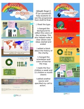
For now, I'll show you some of my favorite infographics my students created. Click on the charity name to see the whole infographic.

- San Diego Hunger Coalition was a group that really took advantage of all piktochart had to offer. They had fun picking different backgrounds, and they stuck to small chunks of text (rather than writing everything down). This group was a clear division of labor. One person researched cool facts and statistics, and the other person played on Piktochart until they found the perfect look. Normally I am more a fan of collaboration (rather than divide and conquer), but this group was persistently communicating, so it seemed to work well for them.
 L'Arche
This student really had fun with the graphics. Every block in her
presentation has the same theme, and all of the visuals go with one
another. She also added little details where possible. For example, one
of the graphics was of a person and it didn't include eyes, so using the shape tools she added
them. Her partner missed a few days of school, so she did most of the work on her
own, and I was really proud of the final product.
L'Arche
This student really had fun with the graphics. Every block in her
presentation has the same theme, and all of the visuals go with one
another. She also added little details where possible. For example, one
of the graphics was of a person and it didn't include eyes, so using the shape tools she added
them. Her partner missed a few days of school, so she did most of the work on her
own, and I was really proud of the final product. Build a Miracle Group was big into incorporating the graphics into the block. That is, nothing was ever stand alone, it was almost one big picture. They also found really great facts to support donating. This group was also one of the most prepared groups when it came to donating. They really worked hard to know their stuff and came across as quite knowledgeable.
 Finally, Las Hermanas San Diego was a really fun group! They went outside the box a bit, and used the graphics in ways that weren't normal. For example, they used rectangles as surfboards, and put people in normal clothes standing on them to make surfers! Adorable!
- the good charities do
- research skills
- visuals
- learning how to use new computer programs
- working in a team
- organizing their thoughts
- evaluating one another
- self evaluating
I have the worksheets I used available for purchase at TeachersPayTeachers if you are interested. You can also download the preview for free to see part of it.
No comments:
Post a Comment
Thanks so much for commenting. Due to spam, your comment may not show up right away, but as soon as I get a chance to approve it I will. I promise to be as fast as possible!